Internet banking for multi-product users: From complexity to clarity
Making online banking easier for small businesses by simplifying
account management and navigation
Problem framing
George Internet Banking for retail is ideal for most users with up
to 10 products. However, small businesses and entrepreneurs, who
operate at the intersection of retail and corporate banking, face
significant challenges when using George.
• Users with more than 10 products struggle to find them in the overview.
• It’s easy to mix personal and business products.
While this issue impacts a relatively small group of users, it is an important one.
• Users with more than 10 products struggle to find them in the overview.
• It’s easy to mix personal and business products.
While this issue impacts a relatively small group of users, it is an important one.
Challenge
Before diving into the solution, it’s worth mentioning that I went
through 4 iterations and conducted usability testing with over 30
users. A key focus of the testing was to determine whether users
could easily find their desired products.
1) Separate Profiles
The first attempt involved creating a profile selection screen,
accessible after login, to help separate products.
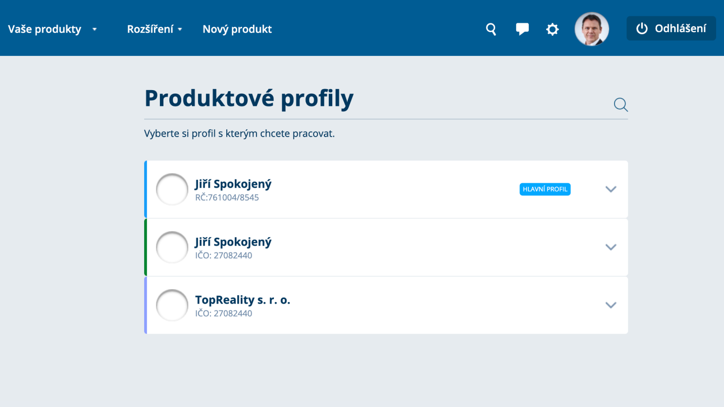
Pros 👍
• Clear separation between personal and business products.
• Familiar interface for users accustomed to older internet banking systems.
• Familiar interface for users accustomed to older internet banking systems.
Cons 👎
• Most users don’t strictly differentiate between personal and
business tasks.
• Missing an all-products overview; users preferred seeing everything together.
• Profile switching cards blended in with products, causing confusion.
• Missing an all-products overview; users preferred seeing everything together.
• Profile switching cards blended in with products, causing confusion.
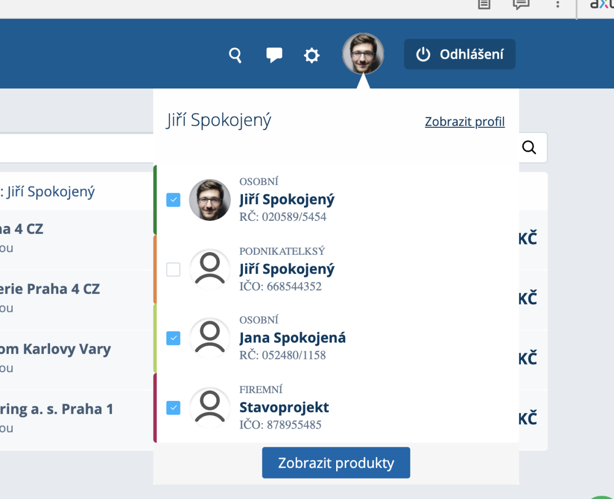
2) Multiple Profiles
The second iteration allowed users to select multiple profiles
simultaneously, with switching moved to the header.
Pros 👍
• Simple and intuitive profile switching.
• Users appreciated the ability to view multiple profiles at once.
• Users appreciated the ability to view multiple profiles at once.
Cons 👎
• Hard to find products that aren’t actively displayed on the
dashboard.
• Many users don’t need multi-profile functionality (e.g., with just two products or profiles).
• Many users don’t need multi-profile functionality (e.g., with just two products or profiles).
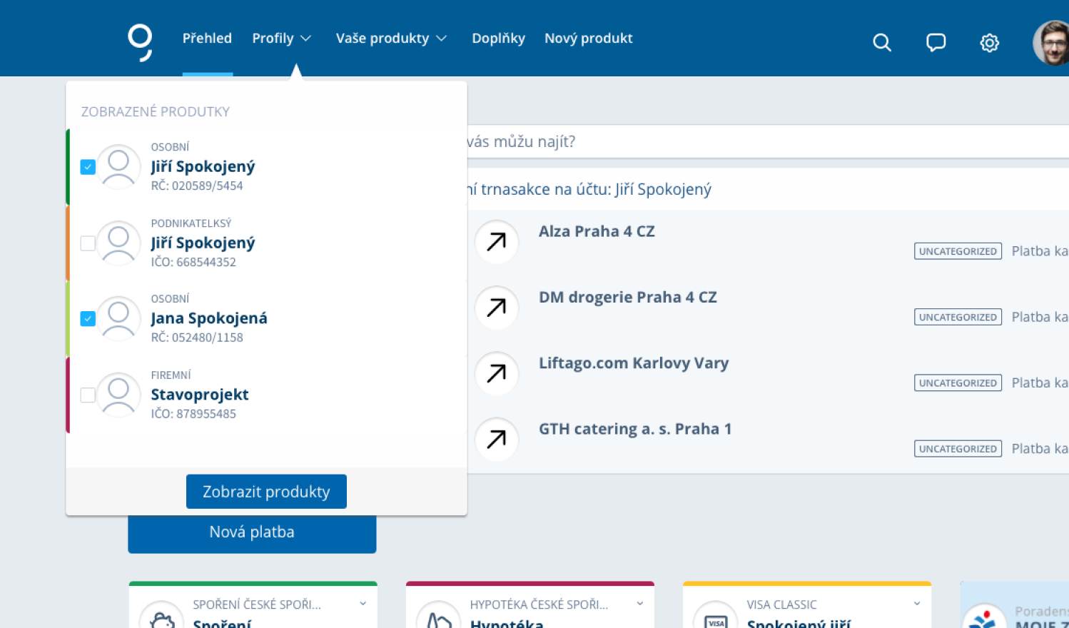
3) Enhanced Overview
The third iteration introduced a product overview within the profile
screen and moved profile switching under the user profile icon
(photo).
Pros 👍
• A list-based product view was preferred over cards.
• Users could access multiple profiles simultaneously.
• Users could access multiple profiles simultaneously.
Cons 👎
• Profile switching under the user profile icon wasn’t
intuitive.
• Product overviews were only visible post-login.
• Product overviews were only visible post-login.
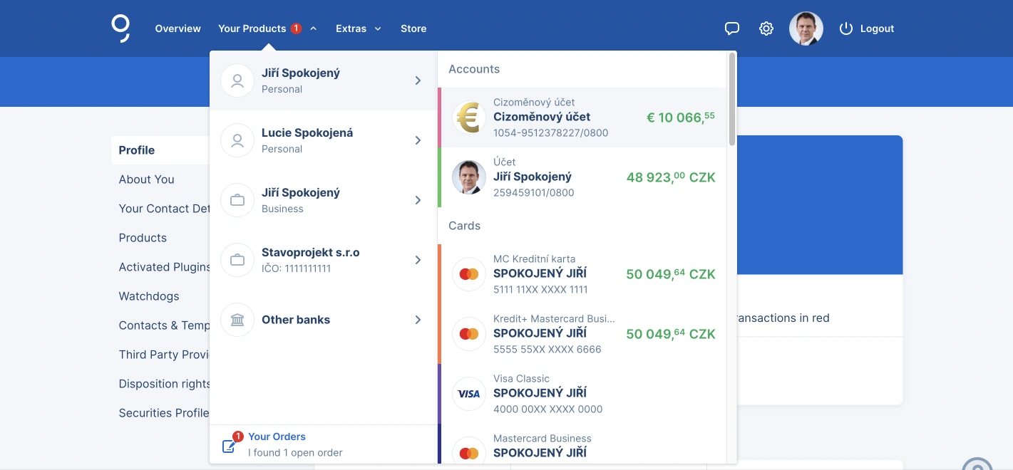
4) Final production version
In the final version, the profile selection page was removed
entirely. Profiles were integrated into a two-level navigation
system under the “Products” tab. While the overview remains somewhat
cluttered, this approach provided a reasonable balance.
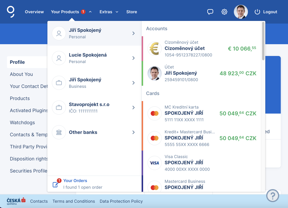
Pros 👍
• Users can easily find their products in the “Your Products” tab.
Cons 👎
• The overview becomes less clear when managing a large number of
products.
Outcome
This final solution strikes a workable compromise for most users.
However, George Retail wasn’t designed to handle a large number of
products, so the focus is now on migrating complex clients to the
new George Business platform.